Contemporary Shaker Kitchen Transformation with Tri-Colour Design | Dublin
Project Overview
Kitchen Style: Monroe Painted Solid Wood Kitchen
Colour Scheme: Porcelain (Main Kitchen), Sage Green (Island), Fjord (Larders)
Worktops: Quartz
Flooring: 14mm Smokey Aqua Stop Laminate
Appliances: Integrated Double Oven & Microwave, 900mm Hob
Service Level: Full Design, Supply & Professional Installation
The Starting Point
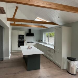
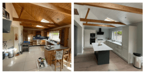
The original kitchen had great architectural character. Exposed timber beams, high ceilings and generous roof lights gave the space warmth and plenty of natural light. It had strong foundations and real potential.
However, the solid oak cabinetry felt heavy and dated. The darker tones absorbed light rather than enhancing it, and the tiled flooring added to the traditional feel. Despite the size of the room, it didn’t feel as open or cohesive as it could have.
The layout also needed improvement. Storage wasn’t fully optimised, with lower cupboards and corner spaces underused. The island wasn’t functioning as efficiently as it should for everyday preparation, and the overall flow between cooking, storage and prep areas lacked clarity.
The space had all the right elements — height, light and structure — but it needed a more considered design to bring everything together and make it work better for modern living.
Here is a more detailed and natural expansion of The Design Concept section, with added depth and flow while keeping it professional:
The Design Concept
Rather than choosing a single colour throughout, we introduced a carefully considered tri-colour scheme to create depth and subtle contrast within the space. The aim was to keep the overall feel calm and cohesive, while allowing different areas of the kitchen to have their own identity.
Porcelain was selected for the main cabinetry to form a soft, neutral base. This shade reflects natural light beautifully and helps the room feel open and balanced against the exposed timber beams above. It creates a clean backdrop that allows the architectural features of the space to remain visible, rather than being overshadowed.
The island was finished in Sage Green, adding gentle contrast without overwhelming the room. Positioned at the centre of the layout, the island naturally draws the eye, so introducing colour here gives the kitchen personality while keeping the perimeter units light and airy. The muted tone works particularly well with the warm flooring and brass accents, creating a subtle connection between materials.
For the tall storage, we chose Fjord on the larder units. This deeper shade adds structure and frames the kitchen visually, helping to break up long runs of cabinetry. It provides a sense of balance, especially against the lighter Porcelain units, and prevents the space from feeling flat or uniform.
The combination of these three tones works because each colour complements the others. There is contrast, but it feels layered rather than bold. The palette adds interest while remaining timeless.
To complete the look, warm brass-toned handles were introduced. Against the painted solid wood doors, they add a refined detail that lifts the overall finish. The warmth of the hardware ties the colours together and subtly echoes the natural timber elements already present in the room.
The result is a kitchen that feels thoughtfully composed — balanced in tone, rich in texture, and cohesive from every angle.
Functionality & Storage
While the overall look is calm and refined, much of the real value in this kitchen lies in the details.
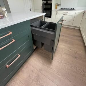
The Sage Green island isn’t just a visual feature — it’s designed to work hard. As shown in the photos, the integrated pull-out bin system is neatly concealed behind the shaker door. This keeps waste completely hidden while remaining easily accessible during food preparation. It maintains the clean lines of the island without sacrificing practicality.
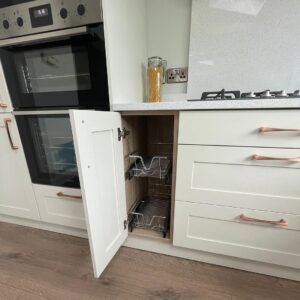
Along the main run of Porcelain cabinetry, lower storage has been upgraded with internal wirework pull-outs. Instead of reaching into deep cupboards, the shelves glide forward smoothly, making everyday items easier to access and organise. This small detail makes a noticeable difference in daily use, particularly for cookware and heavier items.
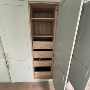
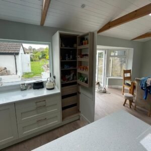
The tall Fjord larder units are designed to maximise vertical space. Behind the painted doors, internal shelving and deep drawers provide layered storage for dry goods, small appliances and bulk items. The internal wood-toned carcass finish adds warmth when opened, creating a subtle contrast against the painted exterior.
Deep drawer units replace traditional lower cupboards wherever possible, offering clearer visibility and easier organisation. Combined with the 900mm hob and integrated double oven stack, the cooking zone feels structured and efficient.
Every element — from concealed bins to wirework inserts — was chosen to reduce clutter and improve usability without interrupting the clean, balanced aesthetic.
The result is a kitchen that doesn’t just look refined in photographs, but functions smoothly in everyday life.
Materials & Finishes
Quartz worktops were selected for durability and a clean, polished look. The light-reflective surface enhances brightness throughout the room while remaining practical for daily use.
The 14mm Smokey Aqua Stop laminate flooring adds warmth underfoot and complements the exposed timber beams, creating balance between modern cabinetry and natural architectural features.